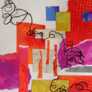
But I loved using my own handpainted collage paper, and—happy news!—it didn't buckle. The lush colors and interesting painted textures were so yummy. And I remembered to throw in a few neutrals.
I forgot to photograph the collage before I added line. Oh well.
 |
| Time to Declutter 6x6", collage and ink on drawing paper abstract 2016 [not for sale] |


6 comments:
Number 1 is my favorite, Dotty! The others are great, but I find myself liking the balance and anchoring of #1 the best. In fact, as I look at it again, I love it. I want a whole accent wall with it! The last one is similar, but I like the 3 orange stripes off center better. Love it that you remembered our good friends, the neutrals. And thanks again for the shout out!
Laurie, thanks for your feedback. As I said in my post, I really didn't feel like I'd found my voice at all with this piece. Of course, what else could it have been but my voice, but I sure didn't feel flow. However, naming it as I did shifted my perspective and brought me around to feeling an affinity for the piece, and putting it away for a few days and coming back to it has also brought new appreciation. If you decide to do a whole accent wall with this, it needs to be in a spare tidy room!
I liked your liking the 3 orange stripes' being off center—I like them best off center, too.
Also, thanks for affirming my use of some neutrals : )
You are more than welcome for the shout out—LOVE your use of colors!
I also tend to like nr 1 the best.
But the exercise with cropping is very interesting! They all look very well, and I think it is great to do play with more off-centered compositions.
When I look again, I might even love nr 3,4 and 5 the best. Their composition leaves more 'open space' which is very interesting I think!
bye!
Simone, it's fun to hear your responses, with your eye for off-centered compositions and open space—thank you.
It enjoyed cropping on the computer and not with my paper cutter. I gained new perspectives with no risk!
When I first created this piece and stepped back to look at it, I was disappointed in not having left more open space. I hadn't realized how crowded the composition was becoming as I went along. However, as I said to Laurie, naming what I'd learned experientially—i.e. Time to Declutter—changed my feelings about the piece to affection and gratitude.
I like the last three, and the last one being my favorite. I like the white space, the movement of the line and the torn edges. The little bit of grey is perfect, to me it acts as a cornerstone to the piece. In the other two, I really am drawn to the interaction of the patterns. So fun :)
Sheila, thanks for your feedback, too. I love how this exercise, during the making of which I felt clumsy, and which in the end looked cluttered, has so much to teach me … with the help of my friends! I especially valued your drawing attention to the torn edges and saying the bit of gray acted as a cornerstone.
Post a Comment