Now, though, Lesson Two feels woven into the fabric of who I am as an artist, so I try my hand at Lesson Three today for the first time—after reading the written part of the lesson more than once!
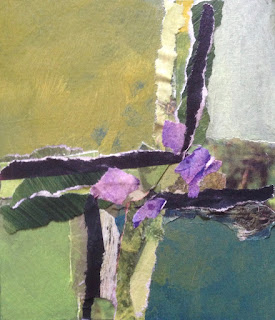
The composition structure for this lesson is the cruciform shape, something I became aware of at a conscious—albeit rudimentary—level back in the fall. A focus in the lesson is to create transitions between the cruciform shape and the quadrants it creates, to integrate the cruciform shape so it is not just Shape on Background. The guidelines instruct me to create my cruciform shape using primarily collage, and to use texture to create my transitions.
Ready, set, go!
Here's my Shape on Background:

Here are the transitions I created with texture to integrate the cruciform shape with the background quadrants:
 |
| Criss-Cross, Logs and Moss 4x4.5", acrylic and collage on watercolor paper abstract 2016 $18 |
Fun!
6 comments:
Love the commentary, the evolution and end result, the pops of purple and the title. You are creative and talented on so many levels!
Great Dotty. Love the colors-wonderful green. You are getting quite innovative, but I suspect that you always were.
Joje, thanks for your feedback and affirmations of my playing with art! This was a fun piece to work on. I propped it up on my tutorial desk yesterday so I could explore the results again and again over the course of the afternoon.
Thanks, Ann. As you well know, the simplest of undertakings—cross on background—can make less than simple demands in the execution. Working out the colors was fun and engaging, as was playing with texture as a way to integrate the various elements of the overall design. Thanks for your vote of confidence in my innovation!
What metaphor do you see here???
Wonderful textures... here's to simple :)
Thanks, Sheila. I'll raise a glass to textures and simple with you!
Post a Comment