Wednesday, November 30, 2016

ATMOSPHERE & SHAPES, Day 11

Huh. Looks like I unwittingly created a bit of an optical illusion here.

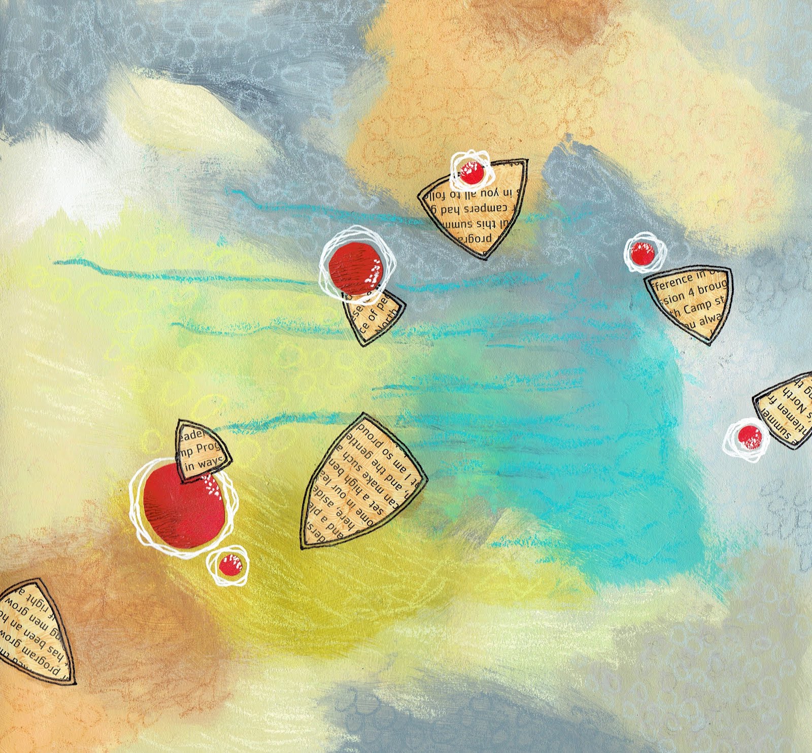
Sometimes the innermost* central triangle appears to be a window looking through to atmosphere behind (it is in fact a cut-out that reveals the underpainting), but at other times it appears to be a bright opaque triangle superimposed on top of a solid red circle which is in turn on top of a solid print triangle.

I'm guessing the black outline in that space may be what teases the perception, along with the difference in value in the atmosphere colors, even though the atmosphere was "all of a piece" before I brought shapes into the composition.

Atmosphere & Shapes #9

* Hmm, is innermore a word?, and would it be the apt word since I'm only comparing two triangles?

Tuesday, November 29, 2016

ATMOSHERE & SHAPES, Day 10

What happens if I veil with color?

Well, a good question … that raises yet other questions—how do I effectively use transparent color to veil saturated opaque color? what differences would I discover if I used transparent color without any opaque mixed in? what effect would opaque colors have in pushing underpinned areas back?

---

I like the lighthearted feel of this piece. Kids playing some kind of game in outer space?

Atmosphere & Shapes #8

Monday, November 28, 2016

ATMOSPHERE & SHAPES, Day 9

The fog here is in the ballpark of what I was hoping to create and then build on when working on Atmosphere & Shapes #2I got atmosphere in place with a feeling of depth and three dimensionality.

Looking at this piece now, though, I'm wondering if it would be more dynamic (a) if I'd veiled more opaquely to push the triangles farther back from the surface and (b) if I'd overlapped part of at least one red orb on top of its supporting triangle.

Always something new to investigate.

Atmosphere & Shapes #7

Sunday, November 27, 2016

ATMOSPHERE & SHAPES, Day 8

I'm not sure where this flock of Reuleaux is flying, but I like the cartoon-y surrealistic impression of somewhat scatter-brained movement across the page! 

This piece has an evocative tone, teasing me with the feeling that I've seen a similar something before.


Atmosphere & Shapes #6

Saturday, November 26, 2016

Friday, November 25, 2016

ATMOSPHERE & SHAPES, Day 6

It was election day when I painted this. I elected to paint.

As I painted, my inner dialogue:

I just don't know what I'm doing.

Oh, wait, that's the point. I just really have to be in the materials and in the process to investigate the issue at hand.


Paint something. 

Respond. 

Paint something else. 

Respond again. 

Go where it takes me. 

Take the one step in front of me.

I like the graphic feel to the little Reuleaux triangle combinations, their crisp edges and saturated colors in contrast to the muted softnesses and misty swirling atmosphere surrounding them. I wanted to see how little real estate my shapes could inhabit and still act as the focus; I wanted to see what I would need to do to make that happen. My shapes here occupy only about 2% of the page but still catch the eye—little spaceships out in the vastness of the universe.

Atmosphere & Shapes #4

Thursday, November 24, 2016

ATMOSPHERE & SHAPES, Day 5

This piece didn't go at all the way I was expecting. 

It feels like kind of an outlier relative to other pieces in this lesson, with its rectangles, crisp edges, and fewer atmospheric softnesses. It's more solid and less atmospheric than my other studies, and it has an abstracted landscape—or seascape—feel to it. I see water, sky, dock, and channel markers.

Initially I didn't like it, but in the end it grew on me and became a favored child. One of the best parts of it is this little bit of its history: 

I had fiddled with this and that throughout the making of this piece, trying to get it to have certain contrasts and a particular energy. One of the last steps I took, with my heart in my throat, was to get out an ink applicator bottle I have (an unpredictable character in my tool kit) to outline the red bits. To my delight, the applicator worked great, didn't make uneven blobby lines, didn't clog up—yay! 

Then, when I stopped scribing the circles, I discovered that all the while ink had been leaking from the lower rim of the cap on the bottle, creating the huge black blob you see in the painting!

Oh.

The (very) good news is that I laughed, that I was open to the surprise (my openness a surprise in itself), and that I actually liked the silly blob—unexpected strength and originality in my painting!

Atmosphere & Shapes #3


Wednesday, November 23, 2016

ATMOSPHERE & SHAPES, Day 4

My investigation here involved exploring how to create an atmosphere of quiet soft dense fog.

I think the investigation needs to remain open!

I did considerable veiling—still takes a push from me—but using a paint knife in combination with painting over collage pieces seems to make for a rough patchy quality that isn't at all what I was after. This looks like fog and starch having a fist fight!

I do like the perky little triangles and circles with their saturated colors, though.

Atmosphere & Shapes #2


Tuesday, November 22, 2016

ATMOSPHERE & SHAPES, Day 3

My first study for Lesson 10 was fun to paint. I was able to go back and forth between intuitive flow and deliberate decision-making with relative ease. Woo hoo!

Observations: shapes predominate, their sizes vary, figures overlap, layer-on-layer gives a strong sense of depth, translucent layers create a feeling of atmosphere, and the opaque white patch pulls the eye deep into the painting.

Gut reactions: I'm fascinated by the white patch; it really seems to glow. Makes me think of the white light often mentioned in near-death experiences! The layers look a little self-conscious in places but overall I am pleased with them. As I worked with this piece, I found myself curious about the ins and outs of interweaving aspects of realism—for example, shadow—with aspects of abstraction.

Atmosphere & Shapes #1

Monday, November 21, 2016

ATMOSPHERE & SHAPES, Day 2

Diving Into the LessonI started by getting a first layer of my chosen palette of colors on ten sheets of paper. I lifted paint; overlapped it; used a brayer; wiped back; and added texture via techniques such as stenciling, scribbling, sgrafitto, and dripping—to create layers, depth, and a feeling of atmosphere, a feeling of 'airiness,' the illusion of space with the quality of endlessness that's found in nature.


sample start of atmospheric background
another sample start of atmospheric background

I repeated the layering process through several rounds until I felt ready to introduce shapes. Once I started putting shapes on the page, I worked back and forth between atmosphere and shapes until they seemed to be having an engaging conversation with each other.  

I elected to limit my shapes and their colors. For shapes I used (an approximation of what are called) Reuleaux triangles (curved sides) as my primary shape and circles as the supporting cast.

Inner Process:

I really enjoyed creating the initial layers of atmospheric background, working quickly and intuitively without any protracted decision-making. I applied paint, responded to whatever appeared on the page, worked with a feeling of flow.

Adding shapes and creating compositions challenged me. Working narrow and deep within my parameters was engaging but often, at the same time, pushed me to my creative edges and out of my comfort zone. Continuing to develop atmosphere once shapes were on the page gave me a good run for my money. Getting pieces to a place where they met my self-created objectives involved a bunch of what felt difficult and fussy more often than I would have wished, but I chose to trust in all parts of the process—not just the parts I enjoyed!

Stay tuned …

Friday, November 18, 2016

ATMOSPHERE & SHAPES, Day 1

For lesson 10, the final lesson of my Jane Davies class, each participant had to devise her own lesson with the goal of staying narrow and going deep. It was harder to come up with a lesson than I thought it'd be.

My Lesson Objectives:

Investigate atmosphere and shapes on 9x9" cheap drawing paper, with all paintings having (a) an atmospheric background in the same color palette and (b) shapes as the focal point.

---

What I Did:

Backstory: I created two pieces based on an early draft of my lesson parameters and realized that I actually wasn't clear on what I meant by atmospheric background! These pieces led me to think that it's possible to have depth without a feeling of atmosphere (whereas I'm not sure it's possible to have atmosphere without depth). In any case, I remembered a downloadable workshop I did back in January—thanks, Jane!—in which the final lesson was Atmosphere. I revisited that lesson, watched the video numerous times, studied the pieces I created last winter … and revised my current lesson objectives to read as they appear above.

pre-lesson exploration 'a'
pre-lesson exploration 'b'


Thursday, November 17, 2016

MOSTLY MONOCHROME, Day 9

I work with yellows today. Paint a start and use a fine line ink applicator bottle to scribble/spill some contrasting black on the page.

Quick. Intuitive.


Mostly Monochrome—start #9

Cover the start 100% using the same palette, using a knife and adding some texture via sgraffito. Again, quick intuitive flow.

Then I step back to assess and make a few decisions. I manifest my decisions with a final burst of ease and flow.

Love the simplicity and graphic look to this piece.

Mostly Monochrome #9

Wednesday, November 16, 2016

MOSTLY MONOCHROME, Day 8

More practice in layering.

Start with color. Add pattern. Add scribbles. Add collage.

And then cover it all up!

Play with a tightly monochromatic palette again.

Even with the little bit of Something Else's being monochromatic, too, it catches the eye, offers up a landing spot, gives a point of purchase from which to seek out whispery evidence of lower layers.


Mostly Monochrome—start #8
Mostly Monochrome #8

Tuesday, November 15, 2016

MOSTLY MONOCHROME, Day 7

My query: how tight can I keep my monochrome and still draw in the eye?

Mostly Monochrome—start #7
October Turns to Honey
9x12"; acrylic, collage, and wax pastels on paper
abstract
2016
$95
[on hold]

Monday, November 14, 2016

MOSTLY MONOCHROME, Day 6

I love painting up a sheet of monochromatic color, wandering around intuitively with my brush to layer, mix, blend, and partner up various hues, tones, and saturations. I just happily fall into the wide open space of the universe.

Eventually I blink, or the phone rings, or I can't locate a particular brush, and I find myself back on earth. So I step back and take a moment to activate the analytical. I stayed very basic and playful with this piece. Wanted to see what would happen if I added a skinny little bit of complementary collage.

What happened was the painting lost some of its depth, I think because the collage was literally and visually sitting starkly on the surface. I went back in with pastels to give everything increased texture, and that brought back some of the depth, but in the end I think this piece needs a little more attention.

Or, it'll make cool collage paper for a future project.

Mostly Monochrome—start #6
Mostly Monochrome #6

Friday, November 11, 2016

MOSTLY MONOCHROME, Day 5

Even with practice, and even with the gift of delicious results, adding layers to a painting is so often difficult. It is not yet second nature to me, not yet a part of the adventure into which I jump with unfailing confidence and excitement.

For Pete's sake, look at what I do to myself. I take a piece of paper—for example, in this case, a card received from the hospice folks who cared for my mom and our family a year ago in October, cut it into a few pieces, and glue the pieces in place. All the while, I know I'm going to paint over the collage. I know it will become no more than an element of texture in the completed painting. Yet I go on to add pattern on the page in a carefully and happily matched color. No wonder I have trouble adding layers!

Mostly Monochrome—start #5
Mostly Monochrome #5


Thursday, November 10, 2016

MOSTLY MONOCHROME, Day 4

The exploration continues—create a piece that is mostly monochrome, with only 10-20% Something Else. Make at least one piece change significantly from start to finish.

I begin with collage, pattern, shape, texture, and scribbles. I use ink, graphite, and pastels.

Mostly Monochrome—start #4
Then I step back.

I identify a few areas of visual interest that could become my Something Else and circumscribe them with pencil. I decide to go with purples for my Mostly Monochrome—varying hue, value, and saturation.

I use pastels to jazz up the busy areas and to link them all in a chain of dots.

I step back again.

Oh. Seems like my Something Else is claiming more than its fair share of real estate, especially since the eye is invited to travel across the entire width of the page.

Huh.

Mostly Monochrome—false finish #4

SO hard to go in and cover up stuff that I like.

But, that's the job that needs doing, so I do it.

And live to tell the tale.

I add subtle texture to the Mostly Monochrome with light tone-on-tone stenciling (photograph not showing that subtlety) and pull back the color in some areas with rubbing alcohol.

Done.

Mostly Monochrome #4

Wednesday, November 9, 2016

MOSTLY MONOCHROME, Day 3

I like playing with monochrome.

I like this hairy little caterpillar crawling across the page.

Mostly Monochrome—start #3
Mostly Monochrome #3

Tuesday, November 8, 2016

MOSTLY MONOCHROME, Day 2

I start my second Mostly Monochrome piece with a loose grid format using a variety of greens, and throw in a little sgraffito and spray-bottle-paint-lifting.

Then, time to cover it all up!

With the sgraffito as backdrop, I create a focused energetic swirl set in a relatively quiet sea of aqua green where I keep the subtle shifts in value and hue soft. Depth and movement come from what ends up looking like strands of seaweed when I use alcohol to lift off paint to reveal under-layers. Ghost scribbles running through and extending beyond the active space add to an overall watery impression and tie the different energy fields together.

I'm thinkin' I'm gonna grab me an inflatable raft and float on top of that lulling tropical water, let some small fry just beneath the surface tickle me with bubbles and nibble my toes.

Mostly Monochrome, start #2
Mostly Monochrome #2

Monday, November 7, 2016

MOSTLY MONOCHROME, Day 1

New lesson in my online 100 Drawings workshop—make pieces that are Mostly Monochrome, with only 10-20% of Something Else.

I revisited the overall workshop description and reconnected with its sometimes-forgotten-by-me invitation to focus on particular elements and create quantity without regard for whether or not the pieces are good or even finishedJust as I was shifting to the new lesson my art friend Simone also serendipitously put words to the workshop philosophy on her personal blog: not going for masterpieces but going for quantity, creating flow and ease.

I (re)set my intentions accordingly as I headed into Lesson 9 with a spirit of investigation—a spirit that was much more present and immediate than was the case with Lesson 8 where I both struggled to figure out exactly what the assignment was and got lost in trying to get it "right."

While my investigation in this lesson also involved "trying," it was of a different sort. I tried one thing, I tried another. I looked at what emerged, made observations, said, Oh, look at that, made changes in response or moved on to the next piece.

I also set an intention with this lesson to work quickly and intuitively. My goal was to post by the end of day five, completing as many paintings as that turned out to be. Midafternoon on day five I said to myself, You're stopping now. Clean up your studio. Photograph these paintings, write your post, and submit

In many cases, to my delight, the combination of the lesson limits for the Something Else and the time limits I imposed on myself pushed me to be bolder and less fussy than might otherwise have been the case. Woo hoo!


Mostly Monochrome, start #1
Mostly Monochrome #1
---
In this piece I see:
a busy bright red/orange area suspended from the top edge;
a monochromatic green field surrounding the focal area;
crisp edges in the red, soft edges and subtle shifts in value and hue in the green;
atmospheric quality and depth coming from layered greens and tone-on-tone marks;
green bits in the red area and red bits in the green area, connecting busy and quiet.


Sunday, November 6, 2016

BUSY & QUIET, Day 8

A classmate in my 100 Drawings class posted the following comment about Lesson 8: I used a very organic approach without thinking too far ahead, trying to just focus on the one step ahead of me.

Jane wrote: YAY!! Everyone should read this. That is EXACTLY the approach for this lesson, for this class, and I think the approach to art-making in general that will keep it fresh. 

Jane's response opened a door for me. 

I absorbed that encouragement and also went back to the lesson where she'd written, You can follow the techniques and sequence of the demonstration piece in the video if you like, but don’t be a slave to them. Feel free to come up with your own methods.

I took a deep breath, stilled myself, and let those messages take hold. 

I knew I needed to start from a place of quiet. I gessoed over an old painting. 

Then I brought to mind a typical bit of ‘busy-ness' from my daily life, e.g. exercising at the gym, and made busy marks on my canvas; next I thought of a typical daily restorative practice, e.g. meditating, and quieted my canvas … after that I—internally—drove to the library listening to NPR (left handed pencil scribbles), met my friend Nancy for coffee (oil pastels), sat to look at a painting demo online (magenta acrylic layering), prepared food (purple stripes), met with a tutee (neopastel scribbles), and so forth until the painting felt complete.

2015 painting on gessobord as a start
Busy and Quiet #8
---
I see a little monochrome here in this piece! The busy area (<25%) has bright oil pastels and ink
contained in a square space. Creating a cruciform format and acting as transitional space,
a gauzy area of three light values of magenta fills about 25% of the painting. A darker,
more opaque magenta offers a vibrant but relatively quiet backdrop.

Saturday, November 5, 2016

BUSY & QUIET, Day 7

I went into a total funk with this one. More often than not, I enjoy the inherent tension, enigma, and surprise of painting as I work through the various stages of order, disorder, and flux. With this piece, Not Knowing felt painful and I couldn't shrug off the heaviness I felt. 

Good thing the universe works in mysterious ways: we lost power late in the day on which I was struggling with this painting. Nothing could have served me better than to step out of obsessive busy into calming quiet. The next morning, with a night's sleep under my belt and a sunny day at hand, what seemed impossible the day before found its way to possible.

collage, ink, acrylic, and graphite to start
Busy and Quiet #7
---
I ended up liking this piece—knock me over with a feather!
The bright colors, black & white, collage, and ink in the lower left corner
call instant attention to their busy selves, even though they claim very little space.
I see the opaque neutral swath cutting its way diagonally across about 50%
of the painting as quiet, with quiet texture. The lower left and upper right corners
read as transitional, both with veiled but still visible under-layers.

Friday, November 4, 2016

BUSY & QUIET, Day 6

More stumbling, more paralysis, more angst, another piece.

collage and ink to start
Busy and Quiet #6

Thursday, November 3, 2016

BUSY & QUIET, Day 5

You might think I'd hit my stride by study #5.

Nope.

Stumbled repeatedly.

But, shazam, so much dendrite-growing going on, and a fun piece in the end.

collaged packing paper and ink as a start
Busy and Quiet #5
---
This piece has a landscape feel, with its busy area (~25%) of bright colors,
collage, ink, and patterns running horizontally across the page.
Quiet space—the whitest opaque real estate—resides predominantly
in the bottom half of the page. Transitional territory includes pencil scribbles
above and below the bright colors as well as dull gray-greenish 'sky.'

Wednesday, November 2, 2016

BUSY & QUIET, Day 4

My fourth piece had as its working title, Jane Tells Dotty to Sit in the Corner. I painted myself into one corner after another after another. 

After another after another. 

Sitting in those corners eventually forced me to breathe into stillness, to both remember Jane's saying, I want credit for keeping the video on while I'm screwing up my demo for this lesson (she gets full credit and my deep gratitude) and to remember her stating in the lesson explanation, Each mark and each layer is essential to the process, even if very little of the original layer ends up in the final piece.

acrylic, collage, ink, and stamping for a start
Busy and Quiet #4
---
The bright green/red/orange area is busy, <25%.
The textural echo of the bright green collage pieces, obscured and to the left,
is transitional, also <25%. The rest is quiet, with texture and subtle color value shifts.

Tuesday, November 1, 2016

BUSY & QUIET, Day 3

The irony/metaphor of Lesson 8 is not lost on me. One of my ongoing life challenges is finding my personal balance between busy and quiet. Ya know how those lessons you don't master the first time just keep showing up to be learned? Yah. That's my story.

I got going with my third piece, could tell I was too busy to find the quiet within me from which to paint, but just kept painting frantically anyway. 

A scene from the decades-old Disney version of Alice in Wonderland, in which the white rabbit sings, "No time to say HELLO, goodbye, I'M LATE I'M LATE I'M LATE" comes to mind. I just could not get myself to stop long enough to realize there was no on time for which I was late.

My manic hurry-up mentality did have the beneficial side effect, though, of letting me just keep moving. One mess followed another, until my next painting emerged.

color blocks and ink for a third start
Busy and Quiet #3
---
This one doesn't fully pass muster in meeting lesson specs because
 I dispersed the busy-ness again (hadn't been called to task yet),
but at the time of creating it, it read to me as small pops of busy (totalling <25%),
 with transitional areas where the bright colors are veiled (≤25%), and the rest a textured quiet.
And, lesson be damned, I do love this piece!